 I am absolutely convinced that when future media historians look back on the first two decades of the 21st century, seeking to understand what made us tick and get a feel for the cultural zeitgeist, it is to television drama that they will turn first.
This is as a result of the gradual ascendancy of longform serial drama – from HBO, BBC, AMC, FX and many others – over cinema as the defining cultural signifier of the times. Historians will study the despair of The Wire, the angst of The Sopranos, the insanity of Breaking Bad, the nihilism of the Walking Dead and Sons Of Anarchy, the post 911 paranoia of 24, Battlestar Galactica and Homeland, or Mad Men and Boardwalk Empire, looking at the past to understand the present. Collectively these shows have far outstripped the cultural significance of anything 21st cinema has been able to offer.
Others have argued convincingly that the last couple of decades have seen a recalibration of the relationship between film and television and that we are in a golden age of TV drama. That is not the purpose of this post, but I firmly believe that the natural successors to 70s and 80s auteurs like Scorsese, Coppola, Allen, Lucas and Spielberg are now television showrunners or creators like Ronald D. Moore, David Simon, Matthew Weiner, Terence Winter, Kurt Sutter, Dan Harmon, Vince Gilligan, Russell T. Davies, Joss Whedon and Stephen Moffatt amongst many, many others.
However what is also noticeable is the way in which this cultural shift is being reflected in another ubiquitous medium – the poster or promotional image.
 When I was at college in the early 80s, the movie poster – pinned or blu-tacked on the walls in student residences – was a statement of ‘this is who I am’. Betty Blue, Clockwork Orange, Terminator, Rebel Without A Clause, Some Like It Hot, Silence of the Lambs, Blade Runner; all had classic poster images and designs that anyone over a certain age can summon from memory. Television just did not generate such powerful single images. This was partly because it was the subordinate medium – in artistic terms if not in consumption.
No one I knew felt that a Quantum Leap or Cheers poster on their wall would elevate their peer group standing or make them attractive to the opposite sex.
However it was also because the imagery just wasn’t there in the first place. Typically art and design used to promote TV shows was unlikely to amount to a logo and a nice newly composed shot of the cast for the next season, something that still persists to this day for many police procedurals and sitcoms.
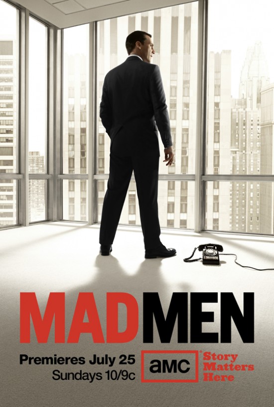
 It was the rise of ‘serious’ serial dramas – referred to by some as ‘cinematic drama’ that gradually changed things. This came to mind when, earlier this week, I posted the new Mad Men season 6 poster on this blog. Clearly a lot of effort had gone into establishing the sort of image that could be iconic, promote and describe the show and hopefully go ‘viral’. So important was this image formed in the head of showrunner Matthew Weiner that they tracked down a 75 year old commercial artist in the UK to get exactly the image they wanted. We have come a long way from JR and family posing in front of Southfork each year. I would argue that over the last few years televised drama has not just been the defining video artform, it has also produced some of the most iconic and defining images and artwork of our times. But where did this come from?
 Going back to the 90s it could be argued that the filmic sensibilities of David Lynch made Twin Peaks a very image-heavy show. Whilst no single poster leaps to mind, show most people this image, used heavily to promote the series and they will know exactly what you are talking about. Laura’s head wrapped in plastic – or Agent Cooper and Audrey sharing a coffee- were starting to crop up on student bedroom walls.

This list is not designed to be definitive but the first TV drama posters that really made me sit up and applaud were those used for The Sopranos. Cast shots, yes, but not like we had really seen them before. The posters attempt to tell a story, they are almost works of art in their own right. The message is clear – this is as good as a movie. But it wasn’t. It was better than that.
The image promoting the last season of Battlestar Galactica was influenced, I suspect, by those Sopranos posters. The posing of each cast member at the ‘Last Supper’ and their interactions is hugely significant and provides clues for what is going to happen. It also makes a great laptop wallpap

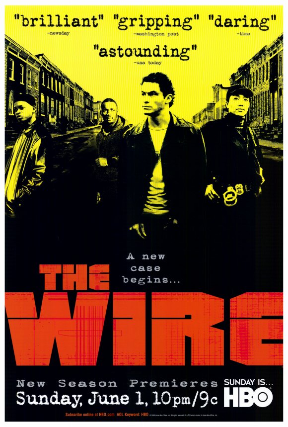
These Wire promotional images are getting closer to movie poster territory – simple but effective, but also like The Sopranos and Battlestar, they are attempting to differentiate and define each season’s narrative arc.


Nowadays, strong imagery is all around us. Designed to go viral (they are, aren’t they, copyright police?) and to create a buzz. A strong movie-style poster or image is now essential to build or consolidate the image of a show. I have already mentioned Mad Men’s glorious season 6 image, but each of these stunning posters have set the tone for their respective seasons – no less than you might expect from a series about advertising itself.


So we have gradually moved beyond ensemble cast shots to pop art style iconography and visual semiotics. How many can think of Breaking Bad without conjuring up Bryan Cranston’s underpants, Battlestar without that red dress, The Killing without that jumper or Sons of Anarchy without those leather jackets?


This design trend recently arguably reached its height with BBC’s Doctor Who. Recent full seasons of the show had been promoted with a single posterised image, photo-shopped and airbrushed to within an inch of its life.
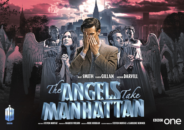
However for season 33 (yes thirty three) showrunner Stephen Moffatt was looking to make a series of ‘mini-movies’ and new ‘iconic’ poster images were commissioned to promote each individual episode of the season. Coming full circle, these featured movie-style production credits as well. The poster for the episode ‘Angels Take Manhattan’ was arguably the best, whilst the one for ‘Asylum of The Daleks’ even inspired a mural on a Brooklyn wall.
 My point – other than an excuse to show these wonderful pieces of art and design? Not only is television now leading cinema as the defining dramatic medium of our times, it is also providing the defining visual imagery and icons.
This is just a personal reflection and I am not arguing television is great therefore cinema is bad – they are both broad churches, spanning everything from Boardwalk Empire to the Kardassians, from The Hurtlocker to The Hangover 3. Cinematic poster imagery can still be stunning. However the days of television as a secondary artistic medium, in the literal sense – in terms of generating iconic pieces of art and design – are clearly long gone.

I agree, I have been watching a lot of TV, and I love a lot of the promotional material generated.
Very interesting article. An explanation why TV Drama and its associated iconography has superseded its cinematic equivalent could be partly due to the influence of a generation of post-punk TV creatives, weaned on the power of image as cultural currency – doesn’t that Mad Man poster remind you of the cover of Heaven 17’s ‘Penthouse & Pavement’ ? Itself a critique of the Thatcherite ‘loadsmoney’ ethos.
Nominating you for an inspirational blogger award, congrats!